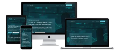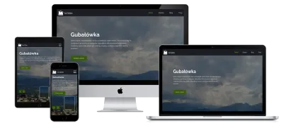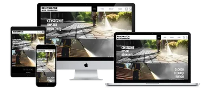
Every tool loses usefulness over time. Especially in a dynamically evolving environment like the internet. Programs must be constantly updated, content publishing methods improved—everything has to be faster and better.
There are still plenty of sites on the web that not only look bad but even put people off with how they work.
We've grown used to intuitive apps, interactive forms of communication, and all kinds of conveniences that work at the touch of a finger. It's never been easier, so if your site isn't responsive first and intuitive second, it's time for a change.
What does a responsive website mean?
A site built with RWD technology—a responsive site—is one that stays "flexible" when displayed on tablets and smartphones. Its individual elements adapt to every screen and every device. This requirement isn't just a convenience for your customers who use mobile internet. For two years now, Google's algorithm hasn't indexed non-responsive sites, meaning an old site won't make it into the top 10 search results—it will end up far behind, where nobody looks.
What does an intuitive website mean?
Intuitive navigation through a site means the user has to think as little as possible and doesn't have to wonder what to do to get where they want to go. Building such sites isn't easy at all, but it's absolutely achievable. You need to know the general principles of good, intuitive interface design, and the site will be "friendly" to the user.